Youth For Christ


Youth for Christ (YFC) is an organisation committed to reaching young people lives changed by Jesus. They approached us with an existing identity that needed a fresh and urban look to resonate with young individuals from diverse backgrounds. Our mission was to build on their identity and create a visual expression that exuded boldness, friendliness, and nurtured a sense of belonging.
Drawing on our in-depth understanding of diverse and urban cultures, we embarked on a research process. This deep understanding became the foundation to elevate their existing identity with a fresh urban feel that would captivate and connect with their target audience.


We built on YFC's existing visual identity, infusing it with a bold and contemporary twist. We enhanced their typography, introduced dynamic colour accents, and curated urban-inspired textures that reflected the vibrancy and energy of urban life. By revitalising their visual elements, we breathed new life into their identity, ensuring it resonated authentically with the diverse young individuals they aimed to reach.
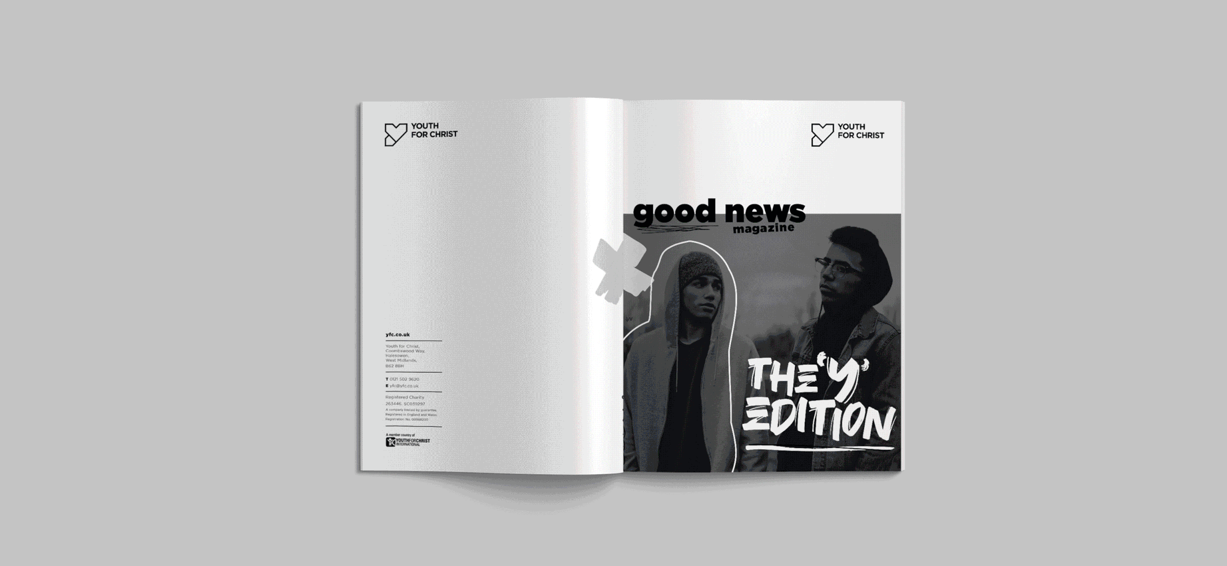
One of our key projects was the transformation of the "Good News Magazine." Recognising its urban feel and existing value, our task was to give it a fresh identity that would truly reflect the urban spirit. We collaborated with the Youth for Christ team and redesigned the layout, introduced bold typography, and infused the magazine with captivating imagery that represented the diverse voices and experiences within the YFC community. The result was a visually striking publication that radiated "city-inspired aesthetic.
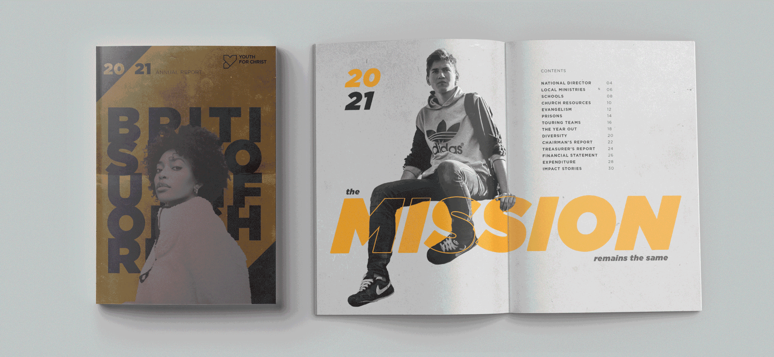
We also created an annual report that would truly capture the essence of Youth for Christ's vibrant energy and creative spirit. Drawing inspiration from the streetstyle, we infused the report with urban elements and a modern design approach. Bold typography, edgy graphics, and a vivid colour palette brought the pages to life, reflecting the diverse and bustling atmosphere of urban communities.
Through compelling visuals and engaging layouts, we ensured that the annual report conveyed the incredible impact of Youth for Christ's work in a way that resonated with young people from all walks of life. The result was an annual report that not only presented key achievements and statistics but also celebrated the passion, resilience, and creativity that define Youth for Christ
and its mission to transform lives.

Through our collaborative efforts, we have played a vital role in elevating Youth for Christ's urban visual identity. By building on their existing brand and giving it a fresh urban look, we have helped them connect with young individuals, ignite their passions, and transform their lives. YFC's boldness, friendliness, and nurturing spirit now shine through their visual expression, leaving a lasting impact on the lives they touch.