Kings-Way Communications


At Sodium & Co, we had the pleasure of working with Kings-Way Communications, a West Midlands-based PR specialist providing tailored PR narratives for engineering and manufacturing companies. We understand the importance of building a brand that reflects the business's values and speaks to their target audience.
Kings-Way Communications approached us with the desire to create a brand identity that would empower their marketing and communication efforts, building relationships and growing their business through their expertise.
We worked closely with Kings-Way Communications to create a brand strategy that conveyed professionalism and expertise while also adding energy and vibrancy to their brand.
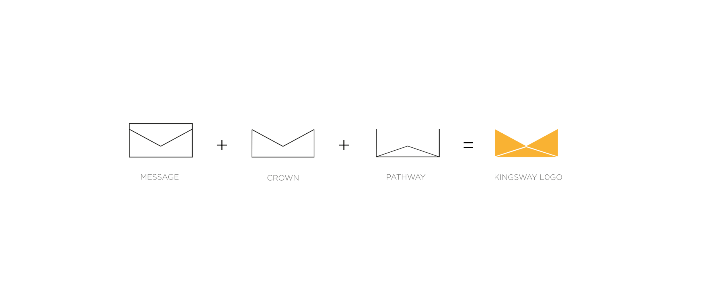
We developed a logo that represents the guidance and influence of the ‘King’s Way’ on their work. The crown shape within the logo symbolizes royalty, while the lines inside represent a journey or path. The overall shape of the logo resembles an envelope, representing communication and exchange.


Our team also created a colour palette that conveys trustworthiness, stability, and professionalism with the use of blue and grey, while adding energy and vibrancy to the brand with the use of yellow. The white colour provides a clean and neutral background, allowing the other colours to stand out and create visual interest.

The new brand identity accurately reflects expertise and professionalism while also conveying a sense of energy and vibrancy. We are proud to have worked with Kings-Way and we believe that their new brand identity will help them continue to grow and succeed.
The Squad
-

Navi Aulkh
Creative Director
-

Chris Green
Brand Strategy
-

Jeremy Watson
Communications / Marketing
-

Paul Ndukwe
Artworker
What we did
Creative Direction
Creative Direction
Brand Strategy
Brand Strategy
Brand Identity
Brand Identity
Marketing Collaterel
Marketing Collaterel
Website
Website