Amblecote Community Church


We were excited to work with Amblecote Community Church in the West Midlands to help them create a brand identity that truly reflected their community values.
Our journey with Amblecote Community Church began with a conversation about their vision for the future. They wanted to expand their reach and make a positive impact on their community. We listened carefully to their needs and goals, and collaborated with them to create a brand strategy that would help them achieve their objectives.
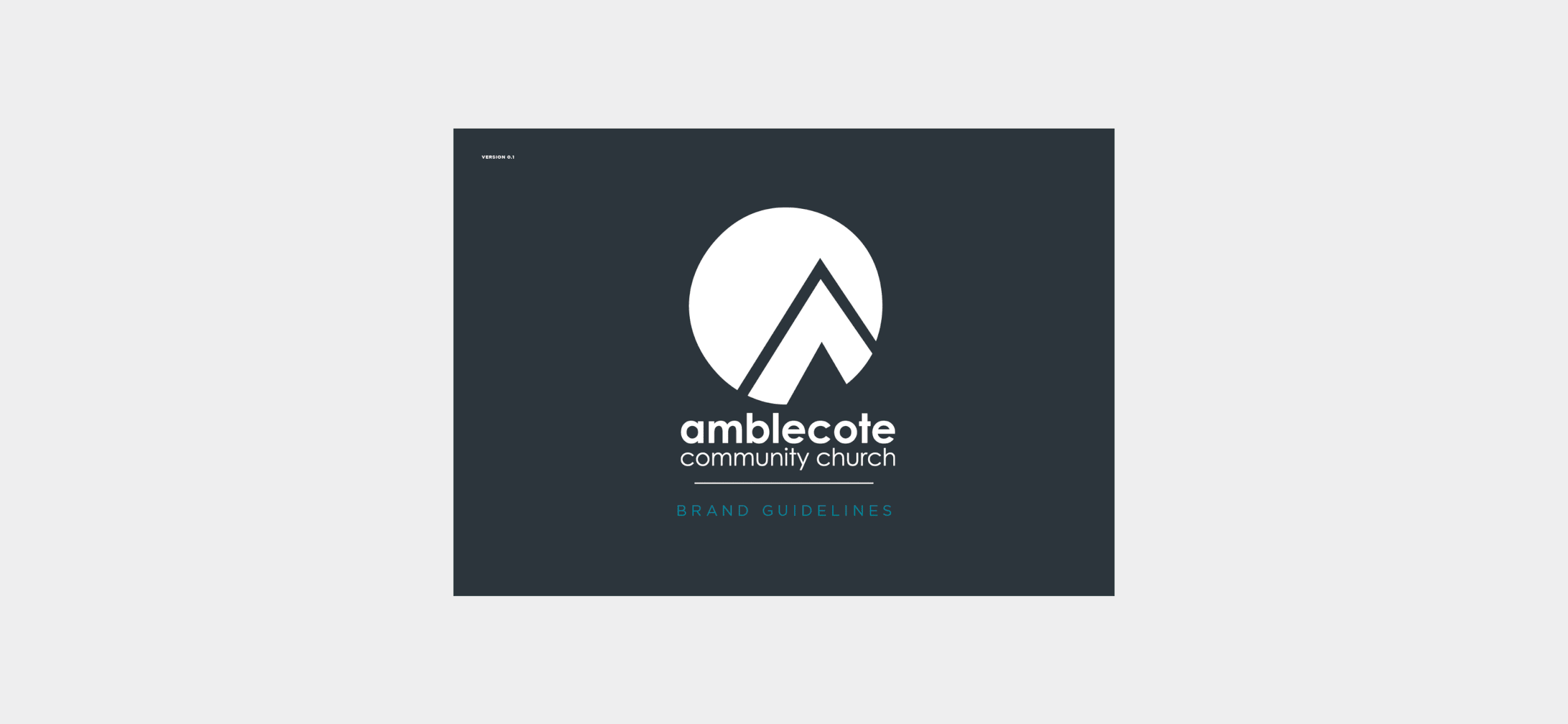
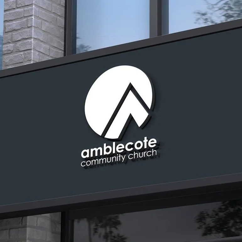
We started by focusing on their community aspect, which was a core value for them. We suggested the brand name 'Amblecote Community Church' to reflect this value. Next, we designed a logo that was inspired by Isaiah 54:2, which represented a tent curtain being extended wide and limitless. The colour blue was chosen to represent feelings of trust, refreshment, energy, and friendliness. We also incorporated secondary colours to add vibrancy and expression to the brand.
To add depth and movement, we used waves in the design, and circle arrows were also used to give direction and to reflect the logo. We also created image holdalls that held lifestyle and cut-out images in the shape of arrows.
The brand identity we created for Amblecote Community Church was not just limited to print and digital design, but also website design. We created a cohesive and consistent brand identity that reflected the heart of the Amblecote Community Church. The result was a vibrant and welcoming brand that truly spoke to their diverse community.


In conclusion, the rebranding of Amblecote Community Church's brand identity was a success. Our team at Sodium & Co worked closely with the church to create a brand identity that was strong, recognisable, and reflective of their values and vision. We were honoured to work with such an amazing community and help them to expand their reach and strengthen their impact in the community.
This Logo has been featured on The Best Church Logo Designs by DesignRush.
The Squad
-

Navi Aulkh
Brand / Creative Director
-

Paul Ndukwe
Designer
-

Jeremy Watson
Copywriter
What we did
Brand identity
Brand identity
Brand Collateral
Brand Collateral
Brand Strategy
Brand Strategy
Creative Direction
Creative Direction