Restore Ministries


We had the opportunity to work with Restore Ministries to create a new brand identity that reflects their passion for restoring healing and setting lives on fire for God. Our team worked closely with the client to develop a cohesive and meaningful brand that would resonate with their target audience and help them to achieve their mission.
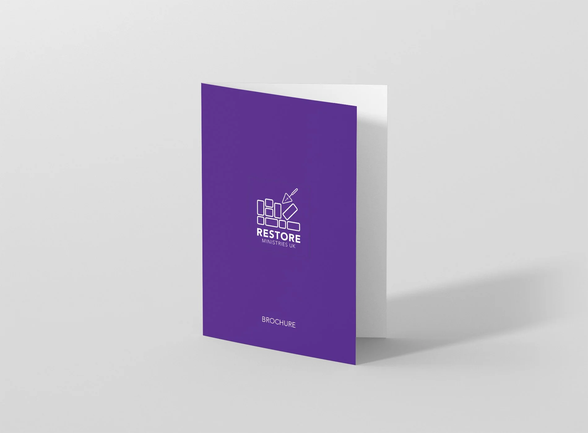
The new brand identity that we developed includes a modern and elegant logo that incorporates the upside-down R and broken wall elements, using deep purple, grey, and white to create a sense of spirituality and grace. This brand identity was then extended to all of Restore Ministries' communication channels, including their website, print materials, and social media platforms.
The results of the rebrand have been overwhelmingly positive, with Restore Ministries gaining more visibility and attracting new supporters to their cause. The deep purple and grey colours are now instantly recognisable and have become an integral part of their identity. The consistency in their branding has helped to create a stronger sense of unity and purpose for the organisation, leading to increased engagement.
At Sodium & Co, we are committed to helping our clients achieve their goals and reach their full potential. Our team was thrilled to work with Restore Ministries to develop a brand identity that accurately reflects their mission, vision, and values. We look forward to continuing our work with Restore Ministries and supporting them as they grow and expand their reach in the future.