Little Harmony


Little Harmony had a clear vision of a brand that combined African and English influences, while also being playful, colourful, and fun. Our team worked closely with Little Harmony to understand their vision and goals, and we were able to create a brand identity that perfectly reflected their unique personality.
We started by creating a distinctive logo that combined African and English influences in a playful and eye-catching way. We then developed a bold and vibrant colour palette that perfectly reflected Little Harmony's brand personality.

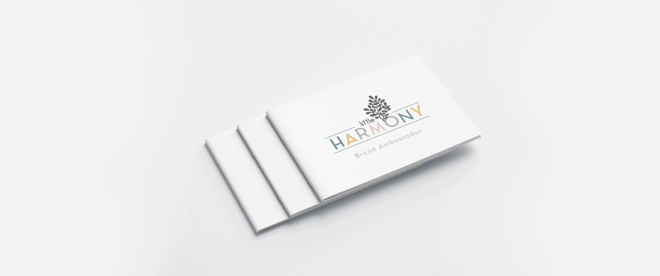
We extended the brand identity to various marketing materials such as business cards, flyers, and packaging, which helped to showcase the new brand. The visual identity was also extended to the company's website design, which was developed to be both aesthetically pleasing and user-friendly.
Little Harmony's new brand was a success, attracting new customers and helping the business to stand out in a competitive market. The brand's quirky and colourful personality helped to communicate its unique selling proposition and made a lasting impression on customers.
The new identity also helped to position Little Harmony as a reliable and trustworthy business, with a strong commitment to quality and creativity. This increased brand awareness and customer loyalty ultimately led to an increase in revenue and growth for the business.


The Squad
-

Navi Aulkh
Creative Direction / Brand Designer
-

Naomi Moyo
Photographer
What we did
Creative Direction
Creative Direction
Brand identity
Brand identity
Brand Collateral
Brand Collateral
Website
Website
Photography
Photography