Heart of the Father

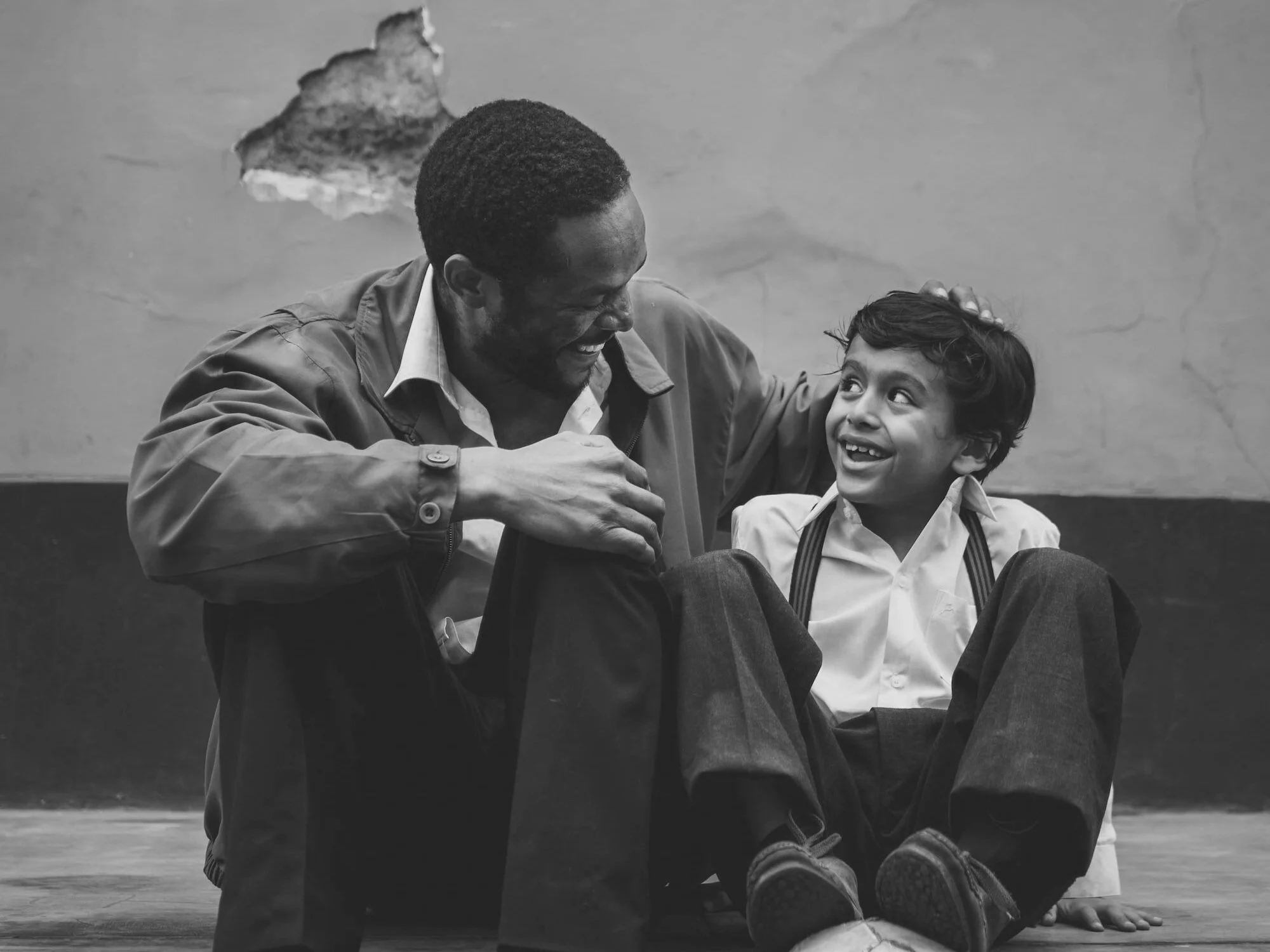

Heart of the Father is a new charity based in West Bromwich, UK. They came to us with a vision of a brand identity that could represent their mission of bringing God’s children together who are wounded or broken.
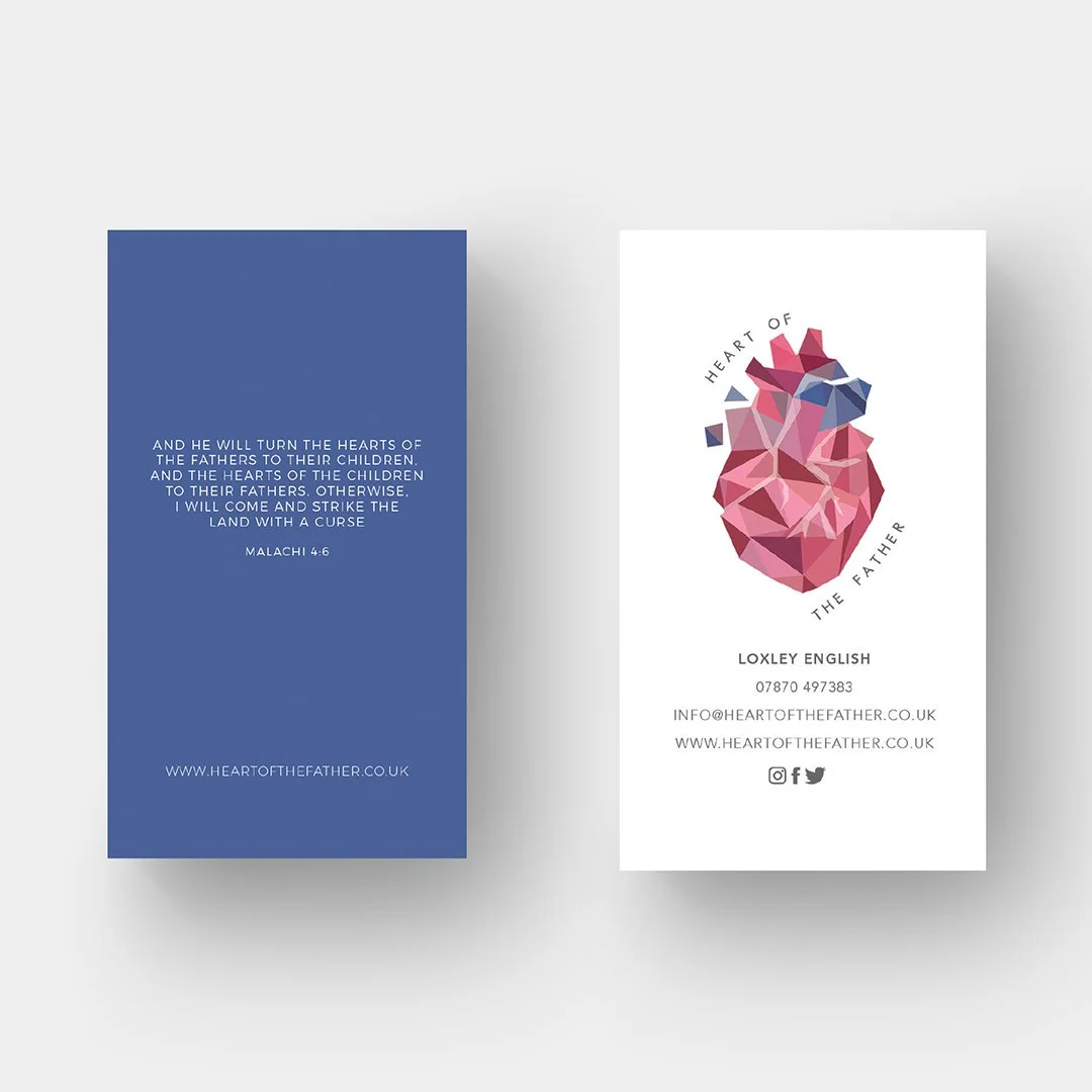
We began by creating a logo that reflected their vision of a heart made up of different segments and pieces.

The logo we designed showcases a heart that is formed by different shapes and colours, symbolising the unity that comes when different individuals come together to form a single entity. The colours used in the logo are a combination of reds and pinks, which create a sense of warmth, love, and passion, all of which are key elements of the charity’s mission.
We then developed a brand identity that would be consistent with the logo. We used a combination of reds and pinks as the main colours for the brand, and incorporated various elements to create a sense of movement, unity, and harmony.
We created a series of print designs, including business cards, invitations and stationary that were consistent with the new brand identity. The print designs we created are eye-catching, memorable, and perfectly reflect the charity’s mission.

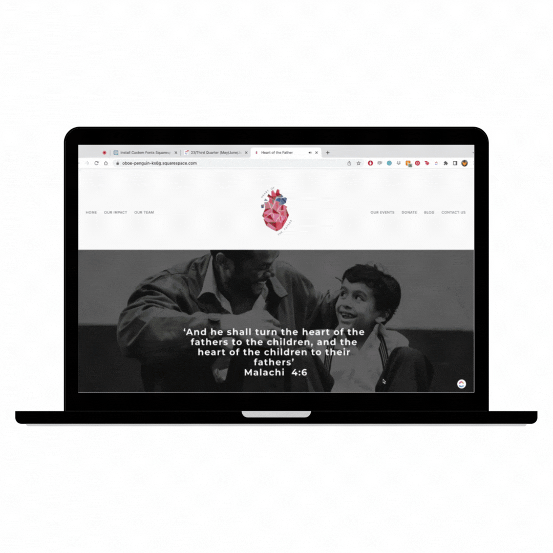
We also developed a user-friendly website for Heart of the Father, showcasing their mission and activities. The website features a dynamic design that aligns with the brand identity, allowing visitors to easily navigate and find relevant information. The responsive design ensures a seamless experience across devices. The website enables Heart of the Father to effectively communicate their message and engage with their audience online.
Overall, we loved the work we did for Heart of the Father. We were able to create a brand identity that perfectly reflects the charity’s mission and values, and we were able to bring this brand identity to life across various platforms, from digital to print. The new brand identity has been very well received and has helped the charity to establish a strong and recognizable presence in the local community.